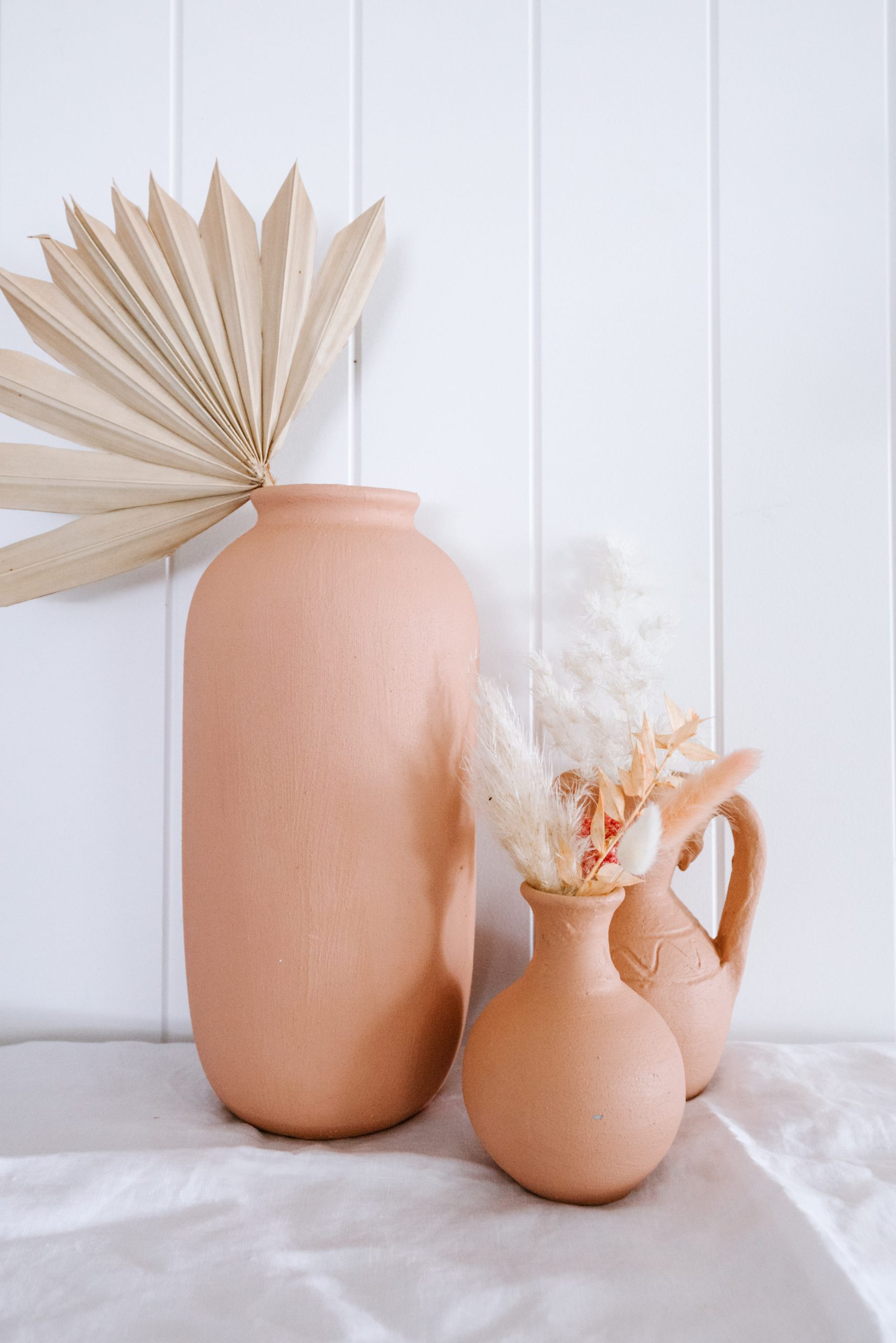
Not all pink paint colours are created equal…
In fact, to be brutally honest, so many of them are terrible (too candy coloured, too bright, too blue toned or just meh). For me, what I want when I use pink is a softly feminine feel that’s still quite neutral. I’ve done my fair share of testing pinks, and in truth it’s always taken a long time to find the right shade. Testing the colours in your space is the most reliable way to check how it will look (we shared how to do that here). But if you’re looking for some failsafe pink options that I’ve used around my home, I thought it would be useful to share them below.
My go to pink paints
Taubmans in Pale Russet
Haymes Paint in Humas
Dulux in Potter’s Pink
Porter’s Paint in Nude
How to find a good pink?
Think dusty Bright candy pinks can be fun in certain contexts, but are much more likely to date than a more neutral, toned down pink. So look for a dusty, almost brownish, tone rather than a bright tone.
Opt for warmer shades A cooler shade can sometimes give a more clinical feel, so opt for a warmer tone for a pink that will go the distance. When in doubt, I like to opt for pinks that lean towards orange, terracotta or brown.
Choose matte In my experience, a matte finish is much more forgiving than a gloss one, so opt for matte if you feel a little torn!


