Welcome to the ‘before’ post!
First up, thank you so much for all your advice, ideas and words of encouragement a few days ago on our new house renovation project! It’s amazing to have such a creative and insightful group of people to share this with. As I mentioned in the first post, I’ve got heaps of before photos of the house, and of course, I wanted to share them with you in one big long post where you can get really stuck in and share all the pretty/grimy details. To recap what I shared with you in the first post, this house is a serious fixer-upper, with lots of major issues that we’re working out through the course of this project. I’ll go into detail about our objectives and plans in the next post, but for now know that what we want to do is create a space that can accommodate both a working studio and a home for us, whilst also retaining all the elements of the house that we love.It’s a definite balancing act but one that I am sure will definitely work out!
We Bought A House: Before Photos!
Before you get into the pics, I wanted to highlight a few challenges and good bits for you, so you know what you’re looking at.
Challenges
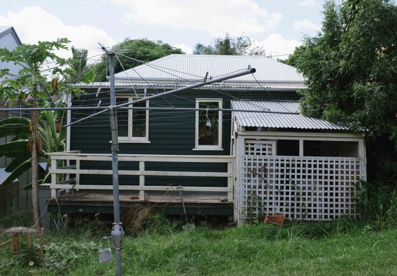
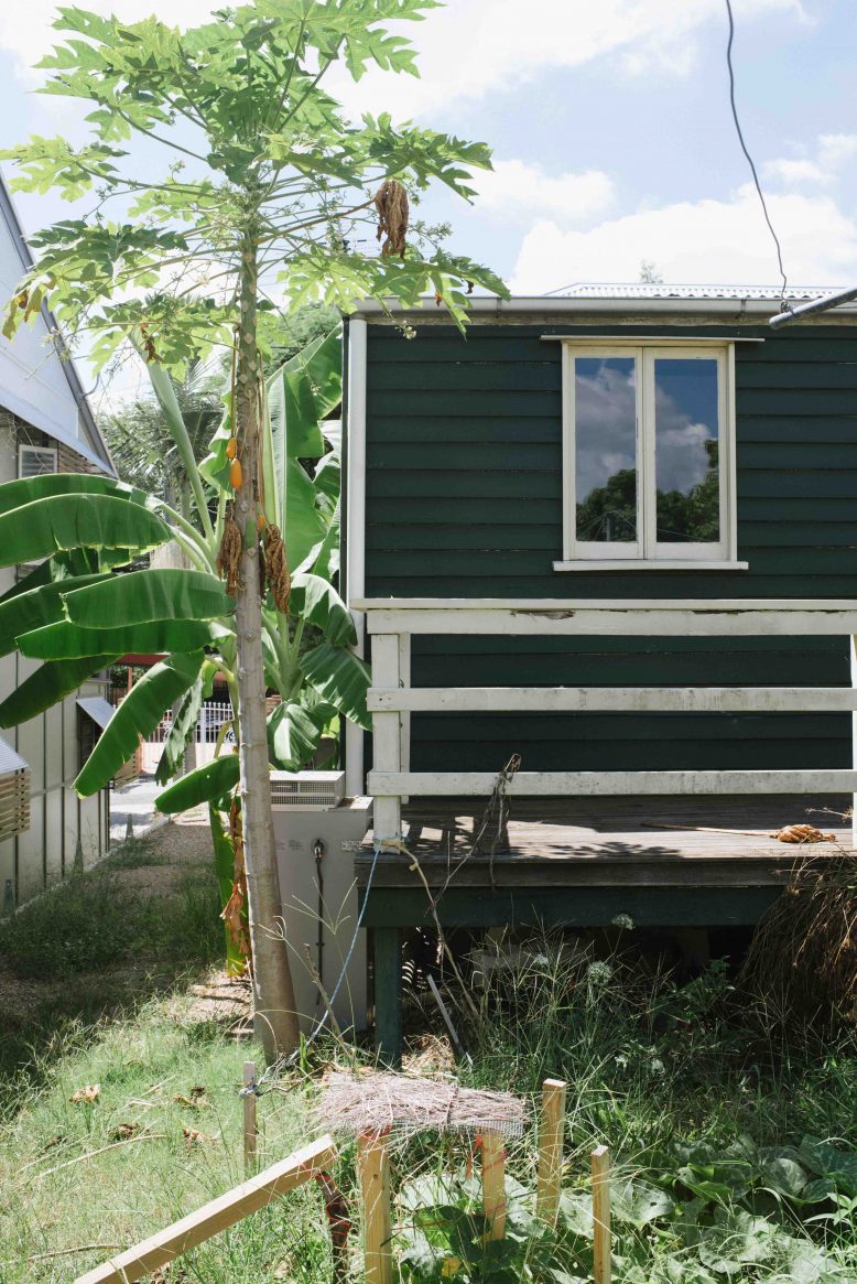
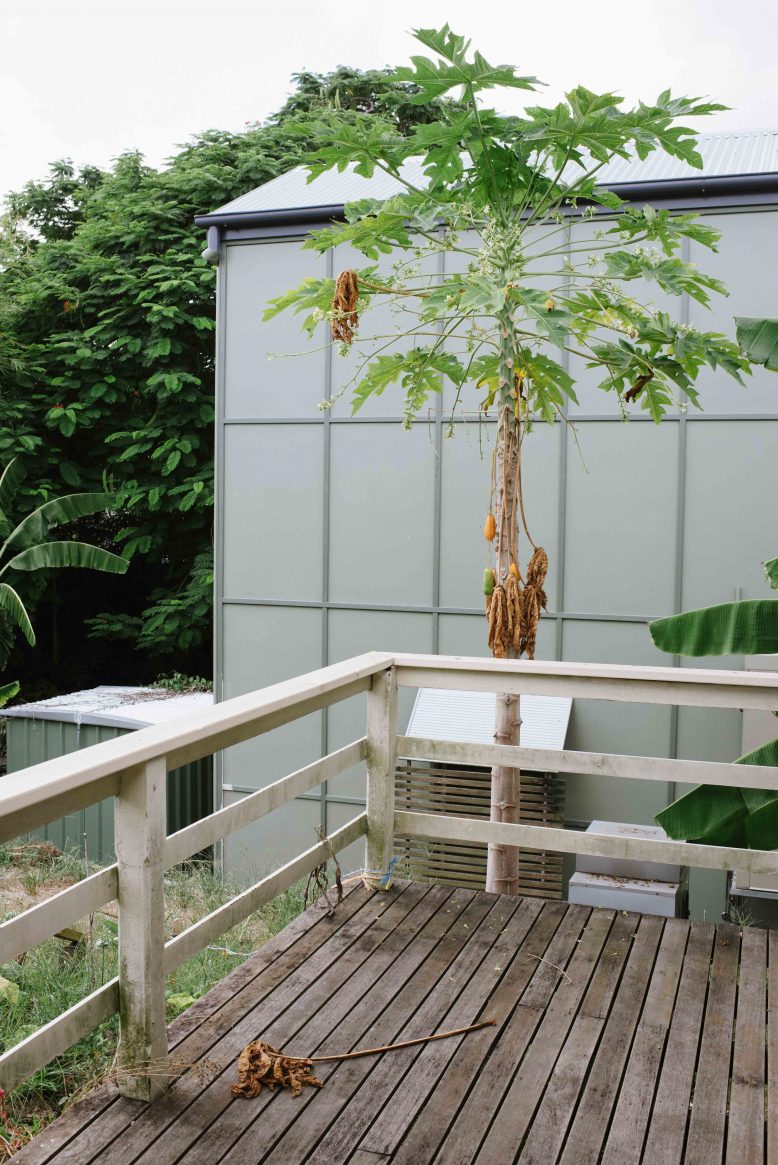
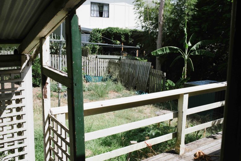
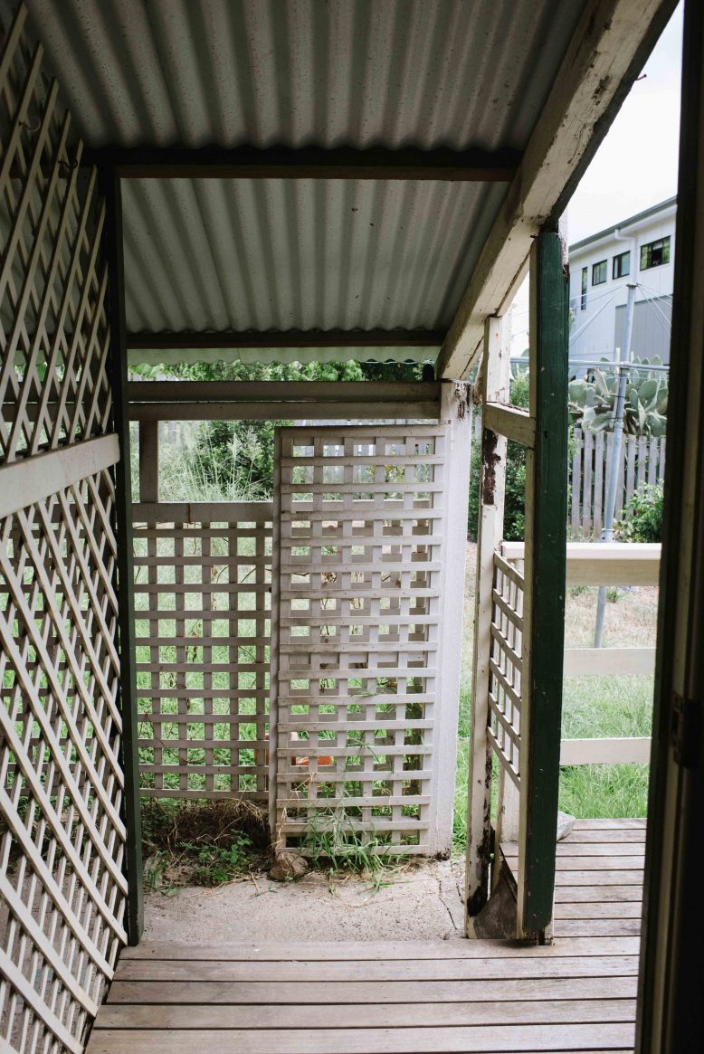
Size of the house You don’t have to scroll through too many pics to see that this house is tiny with a capital T. It was built in 1871 in the popular workers cottage style of the time, with a front deck/patio, two bedrooms at the front, a small living area, a tiny kitchen and a back veranda. Since then, there’s been barely any changes to it, other than a kind of wonky, just about to fall off, addition to the back.
Size of the site Not only in the house minuscule, but the site itself is really small, meaning that any addition to the back is going to eat into the garden and require us to lift the house, something that we can live with, but we’ll have to be creative with outdoor space!
Aged/crumbling fabric There’s going to have to be a lot of restoration to some parts of the house, so that we can keep the fabric that we like intact.
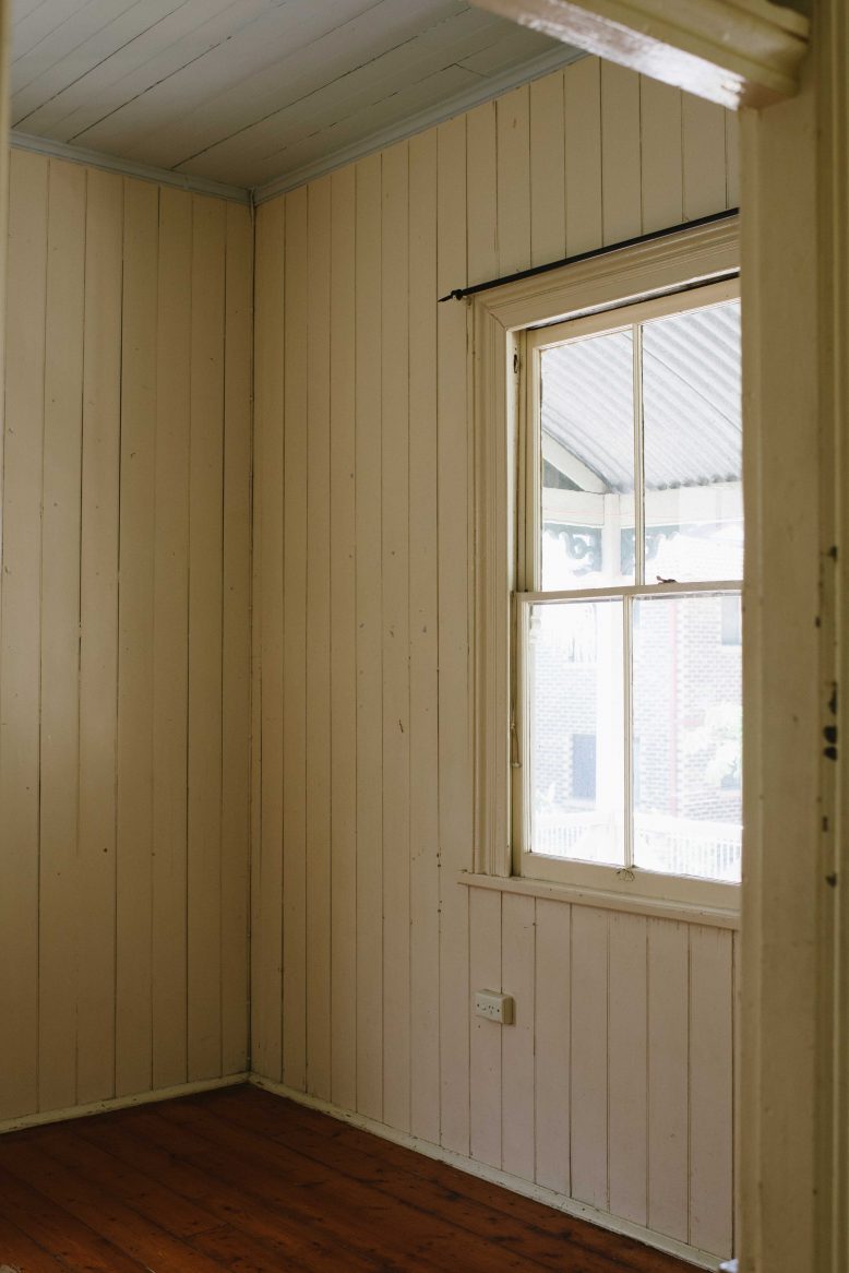
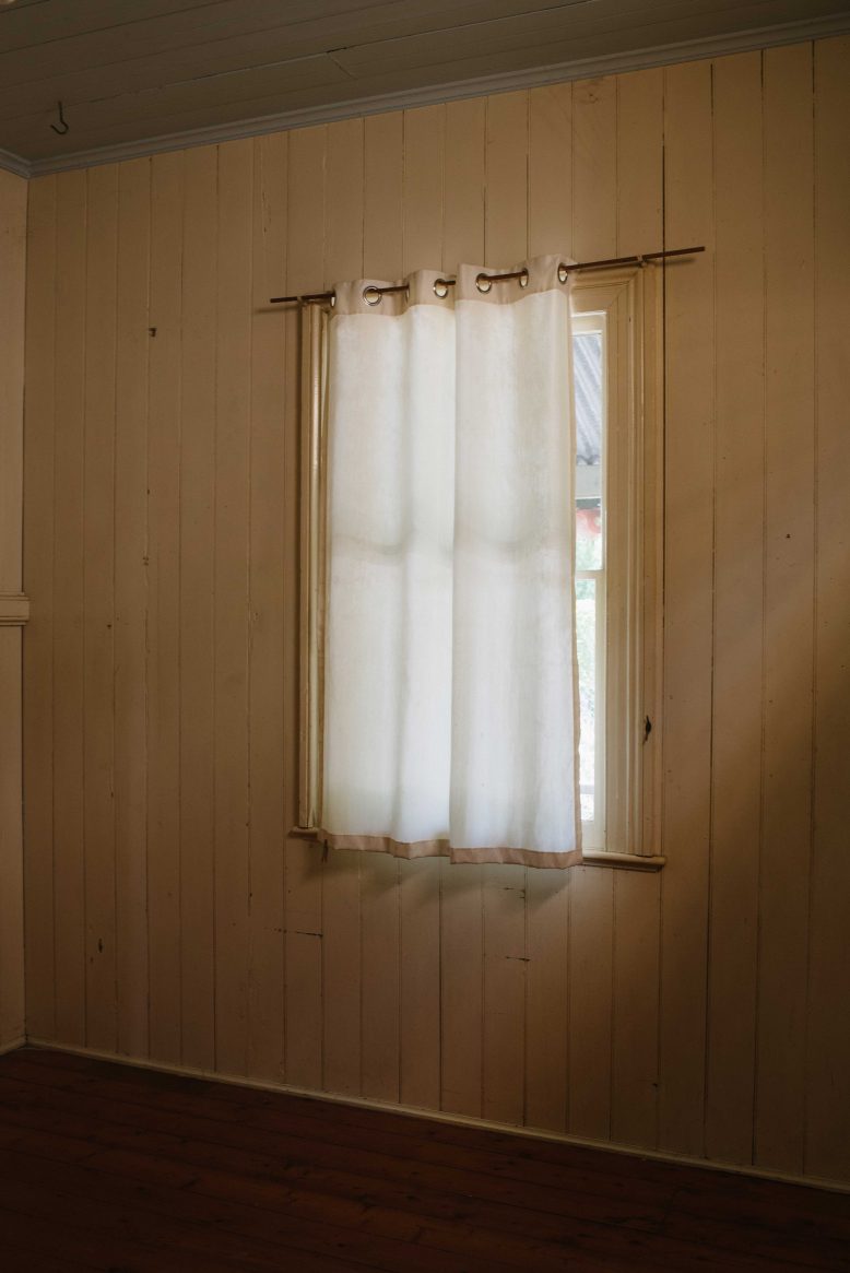
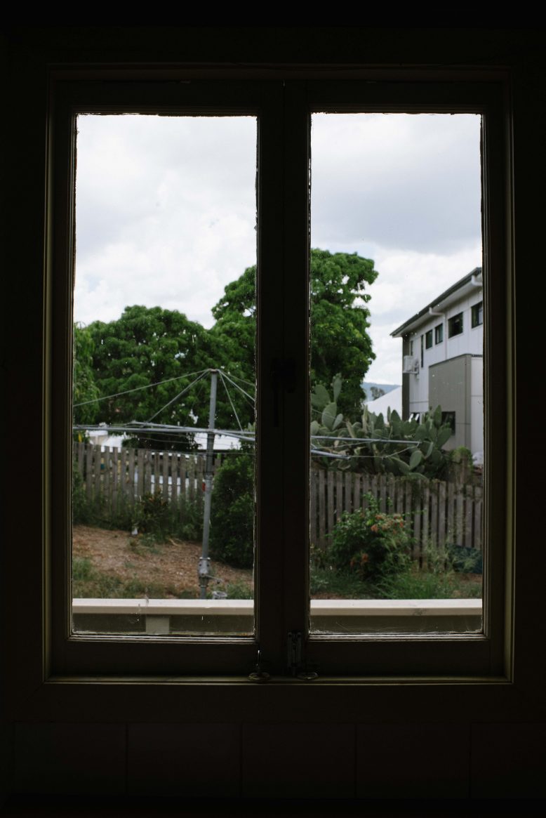
Lack of Light One thing that is so so important for me is enough natural light inside the house. This cottage was built in the days prior to air conditioning (and, well, prior to anything but a horse and cart) so focuses on keeping the heat out rather than letting light in – meaning there’s only a couple of small windows.
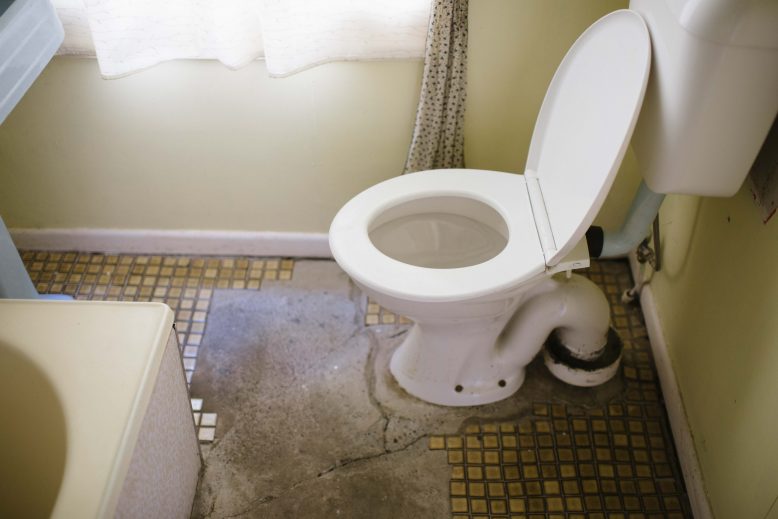
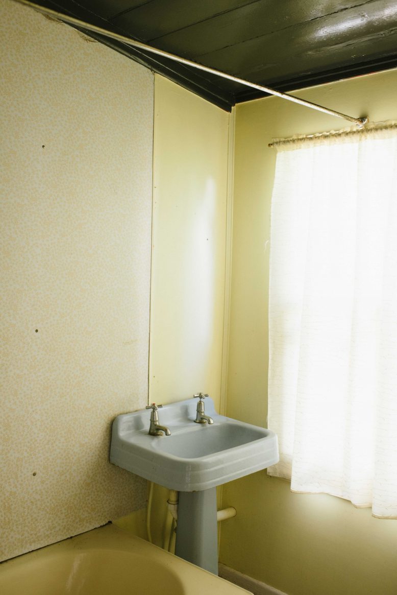
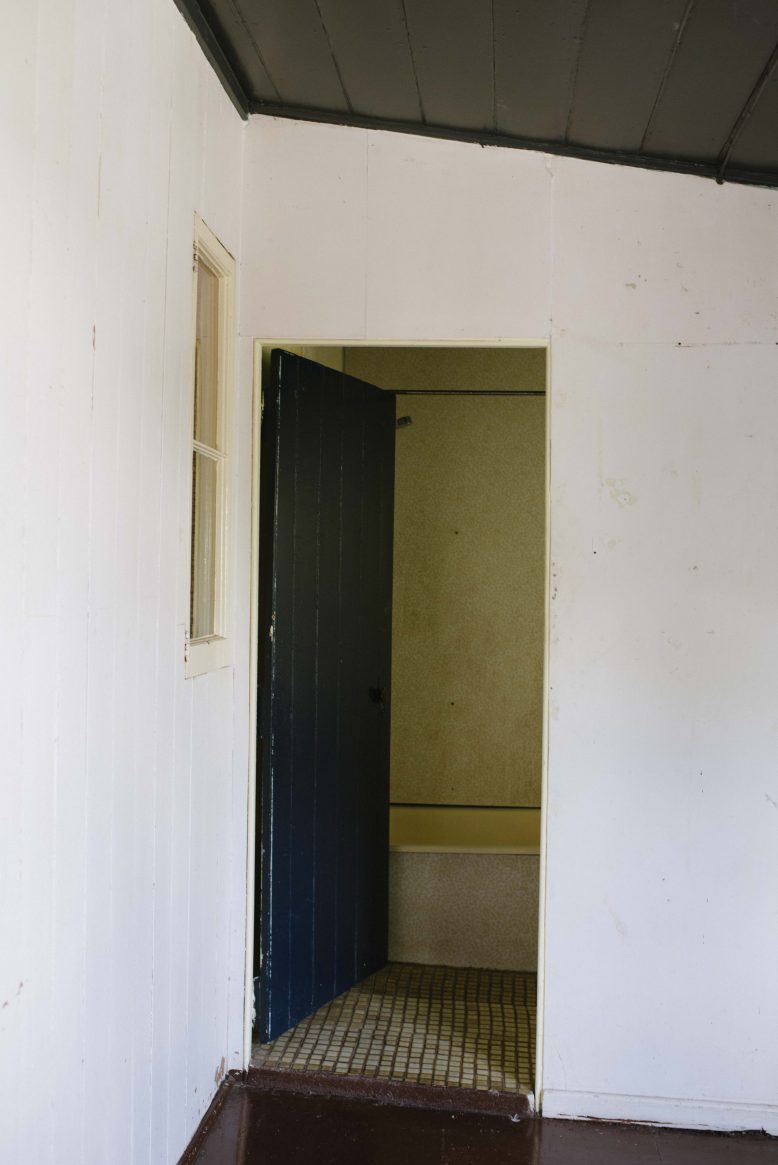
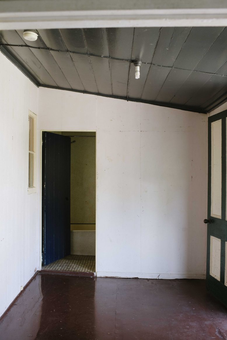
Tiny kitchen and bathroom It goes without saying that the tiny kitchen and the bathroom (got that Psycho the movie vibe) don’t cater to what we need, so getting them right is a big part of the process.
Things we love
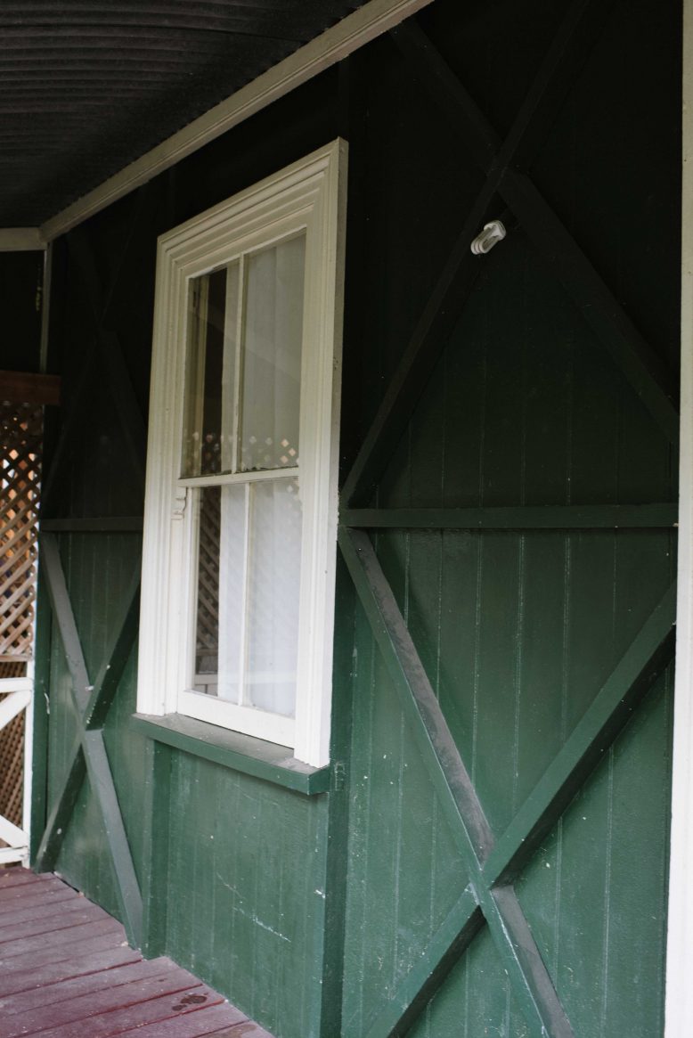
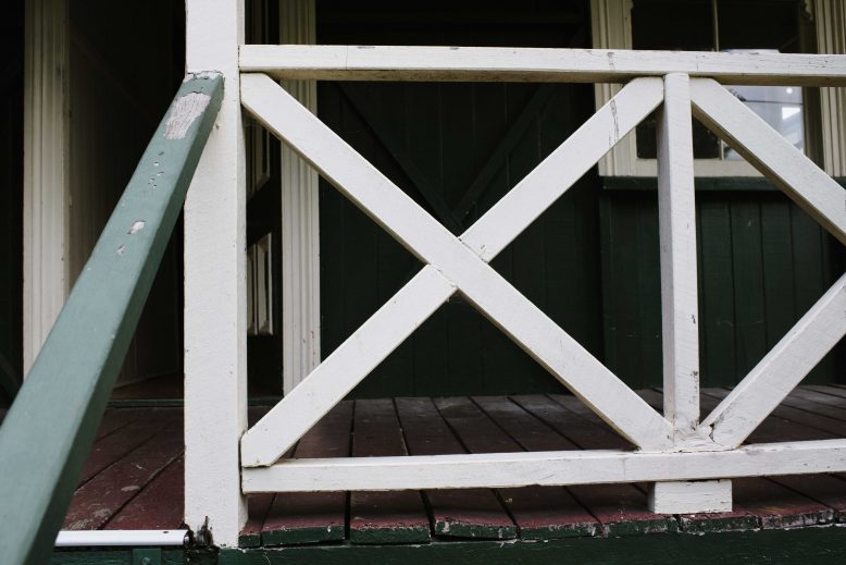
That Front Veranda The frontage of the house with its wooden cross bracings, traditional railings and curved corrugated iron roof is incredibly unique and characteristic to cottages like these built in the late 1800’s. It’s really this space that makes you fall in love with the house.
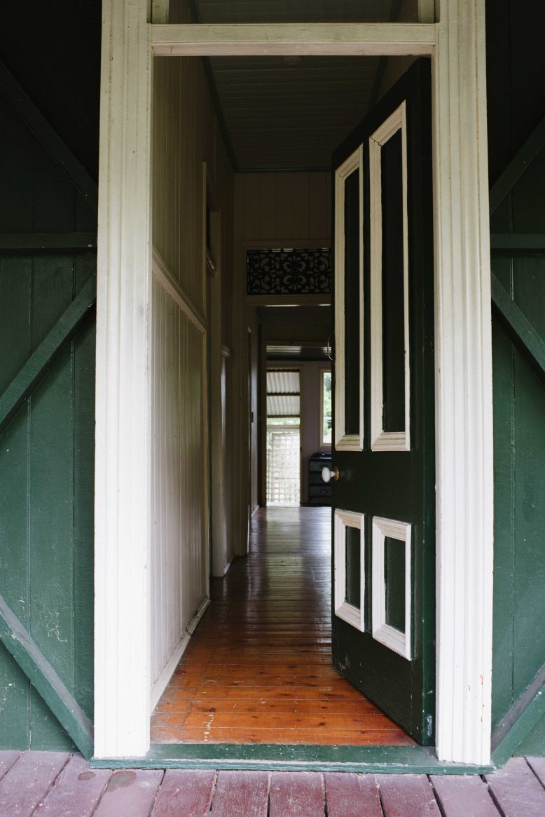
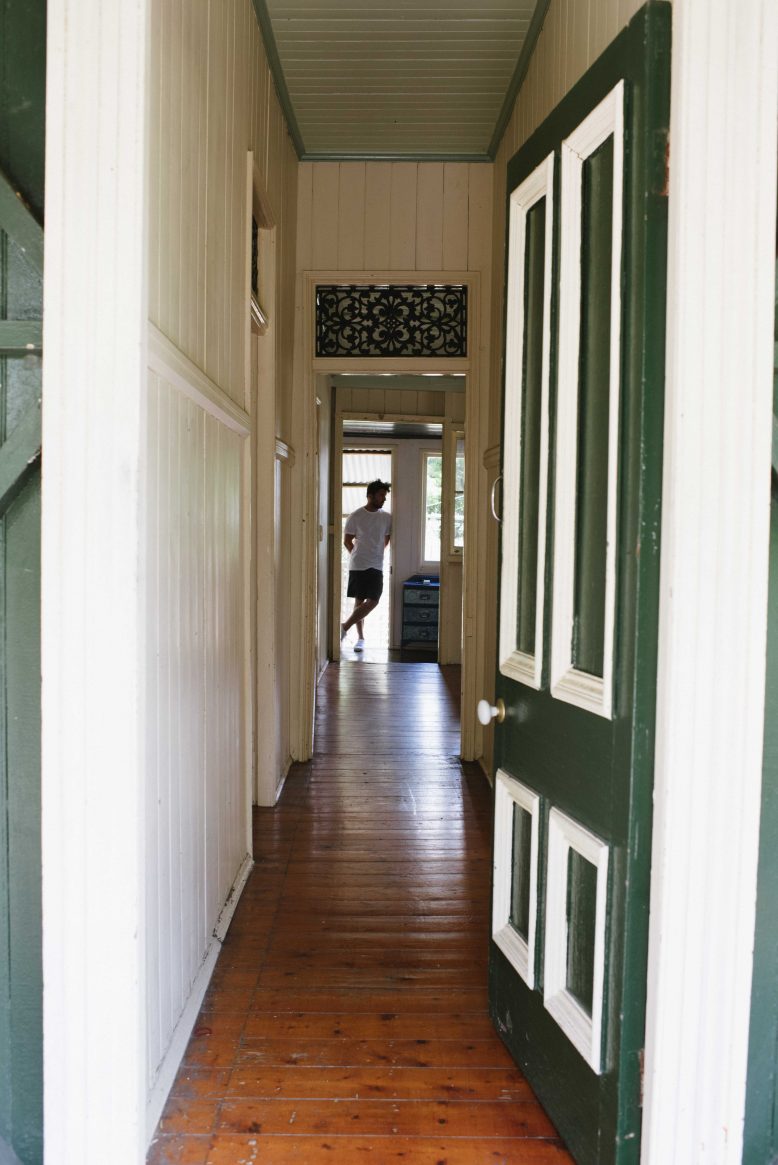
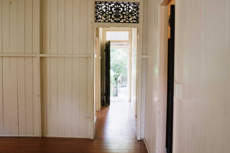
Internal Details Everywhere inside the house there are really lovely details – the steelwork above the doors and the picture rail beams around the rooms are just two of the things that remind you over and over that this house is special and really old!
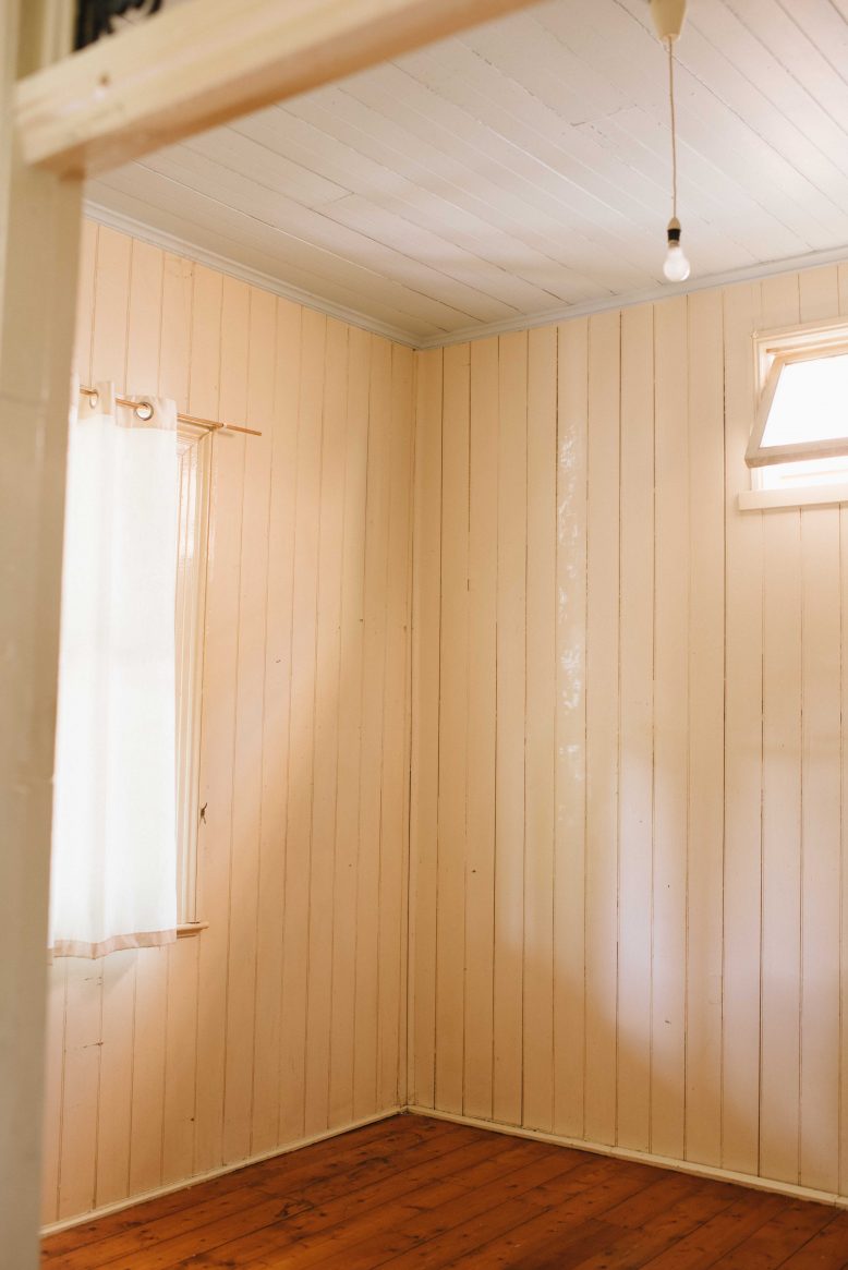
Original Floors The floors for most of the house are original to when it was built, made of a polished pine wood that shows the knots of the tree and also, sentimentally, the passing of time.
Pitched roof These type of gabled cottages were usually built in the same style – with a pitched roof covering a house that’s two rooms wide and one room deep, and for that reason the front roofline is a big part of the essence of the house.
Casement windows Although the windows are small, they are an important part of the character of the house and particularly on the front and sides they give the house so much character. So we;ll be lookinat how we can create more light without removing these design features.
Tongue and groove walls Finally, the timber walls, in a typical tongue and groove style (this term describes the internal joining of the timber pieces), are such a nice part of the house.
- Before
- Before
- Before
- Before
- Before
At the end of the day, Ben and I both love heritage details (as an aside, IMHO one of the things that sets Ben’s interior designs apart is that his team integrate aged and antique details so a project feels genuine and real, hence why we’re always antiquing/digging in junkyards!). So we absolutely don’t want to lose the things we love about the house, instead we’re aiming to marry these with a few design elements that make the house really liveable and cater to our space needs. Wish us luck!
