Hey guys! Well I have to say, things have been roaring along at the Best End House Renovation. Hopefully you’ve caught up on all the behind the scenes of the construction! Today, we’re sharing with you a teeny tiny sneak peek of the house…
When West Elm got in touch recently to see if I wanted to work together on creating the perfect bedroom design (one that was snooze-inducing in the best kind of way) I was super excited. Not only have I got big plans for the bedrooms in the house, but having worked with/under Ben I know there are soooo many things you need to consider, more than just the softness of the mattress (although that too is key, and up for major debate).
Luckily this room was one of the ones that was finished first, I guess because once the spaces were carved out all it took was a lick of paint and the floors stained to make it sing. And it was soooo exciting to style a space in the house – designing it has been an incredible experience but there’s just something satisfying about taking it to the next level and creating a space you could actually live in (if there was power and water haha). To create this space, I worked in collaboration with West Elm and Kikki K, to celebrate the launch of Kikki K’s new More Sleep Please collection.
Tips for Designing The Perfect Bedroom
Location, location, location Ok so if you’re renovating, where you put your bedrooms may already be set, but if you’re starting from scratch or have some flexibility, it’s a good idea to consider where you put your bedrooms based on heat loading – where the sun heats the house and whether you want to block the heat or use it (this will come down to your climate – we wanted to block it). The other thing to consider is soundproofing, and by that I mean try to avoid locating a bedroom, particularly where the head of the bed would go, right up against a wall that adjoins a bathroom or kitchen, or other noisy space.
Get Breezy Good ventilation makes for a really nice room in the summer months, so considering having a few windows that are located for optimum airflow – ie across from each other.
Let there be Light Natural light is absolutely key in a space, something I’m sure you’re pretty sick of me banging on about. Apologies but it’s major for me! Creating a light and bright bedroom space that makes you feel happy is the goal, so consider where you put your windows and whether skylights are an option if the room doesn’t get much light. Ben designed this space to have an amazing window that is along the roofline, which has allowed for optimum light!
But also, Let There Be Dark You absolutely need the ability to make the room as dark as possible, so make sure you consider what window coverings you will have for the space. We’re thinking roller blinds/venetians!
Get Lit From the perspective of artificial lights, if you can make sure to locate your downlights anywhere other than directly above your bed – there’s nothing worse than lying in bed and having lights blind you. To the sides of the room works well in this case (again, you’re going to have to consider where the bed goes).
Power Up Think about where you plan to locate the bed in the space and put power points next to each side of the bed for lamps or other items that need power (other than phones… cos they totally belong outside!). If you’ve got a big room and the bed could go in more than one location, add more powerpoints… More is more when it comes to powerpoints (IMHO), even though they can be a bit ugly.
Measure Up This one is obvious but when you are planning out a space, but if you can make sure that your bed etc will be able to fit in without too many awkward narrow walkways or a need to have a bed against a wall. This is a bit of a luxury if it’s a small house or a small room, but it’s worth keeping in mind. If in doubt, use masking tape to check because it’s often hard to tell just by eye or on a plan.
Creating A Comfy, Snoozy Space
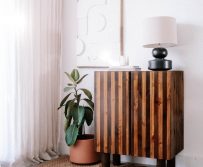
Furniture I’ve been a huge fan of West Elm’s mid-century collection, so knew it would be front and centre for this styled bedroom space. I love this gorgeous bed, side table and dresser and think they work so well together!
Mirror Mirror If there’s one piece of furniture in this space I love the most, it’s the arched mirror. I love archways in spaces but in a cottage style house like this it’s a bit tricky to use them for doorways or other architectural details. Instead, I decided to add them as mirrors and I love how they look! What’s even better? I bought this one from a garage sale for 5 bucks! It came in a really ugly plastic frame but I easily got it out. Voila!
Plants It’s not a bedroom without some soothing greenery, but instead of going OTT on the number of plants, I went for size in a single one. This fiddle leaf fig is dreamy don’t you think? Particularly when paired with this mid-century planter.
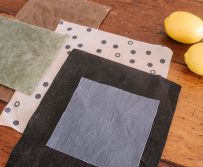
Textiles Soft and comfy is key to a bed that makes you doze off in under five minutes, so we started with this Jute rug, and then used West Elm’s linen sheets for the bed, along with some rust velvet cushions and a big dusty pink wool throw. The mud cloth ones we made ourselves!
Decor All the decor in the room is focused on creating a calming space that’s a joy to fall asleep in, so we added candles, lanterns, and books, along with a tea cup and teapot and of course, a super silky eyemask. And done!
By the way, this Armadillo & Co rug was the perfect addition to this space, being quite neutral but so comfortable underfoot and the perfect size for a bedroom.
Thanks for tuning in for this little sneak peek and a guide on how to design the perfect bedroom, obviously I’m bursting with excitement to share the before and afters very soon. And in case you’re wondering how we’ve got it done so quickly… Turns out pregnancy is a great motivator for getting things done (obviously big shout out to Ben who has really kept everything moving when I was at my worst!).
This post is in collaboration with West Elm.


