Hey guys! It’s been a while since I’ve had a renovation update for you and in case you were thinking it had completely stalled, it has, in fact, been the complete opposite.
In true Ben style, there’s been no dilly-dallying on this project. ON TIME AND ON BUDGET (as he always says), and indeed that’s *pretty much* been the case. Very soon I’m going to be sharing with you a looonggggg video of all the behind the scenes of construction process (including a very edited selection of imagery of us at the hardware store, because it turns out that going to Bunnings is a twice daily occurance when you’re renovating) but in the meantime I thought it would be nice to quickly run you through a few of the inspiration and materials we chose for the house. You guys helped with the paint selection, which I am most grateful for!
The Inspiration
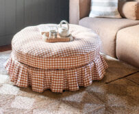
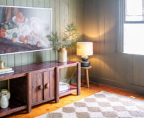
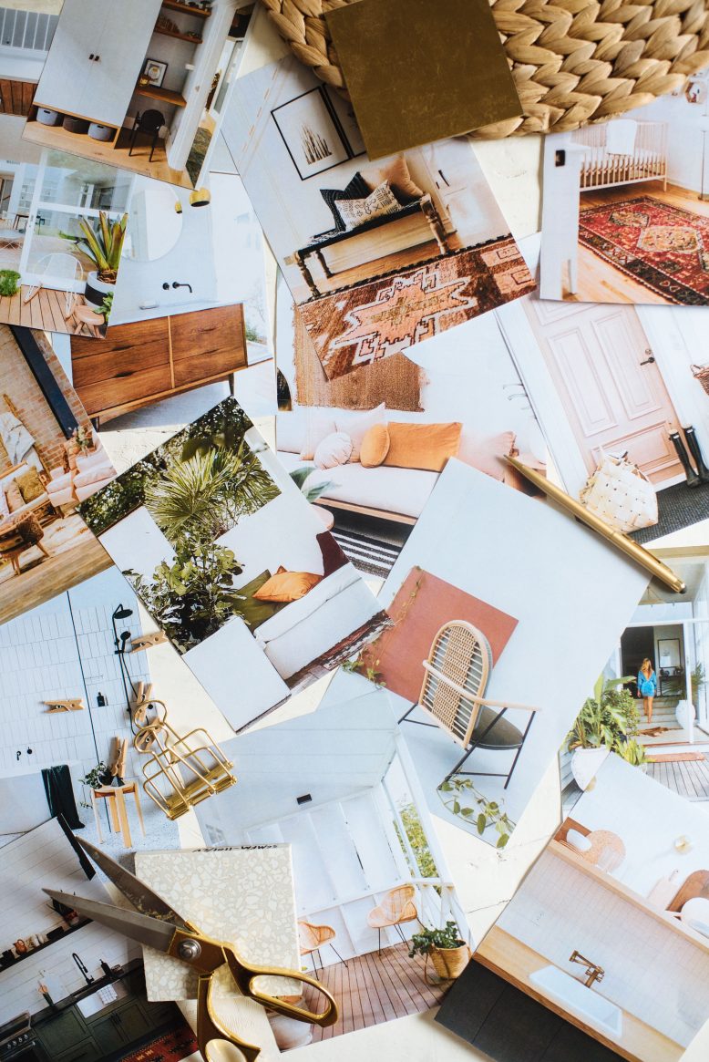
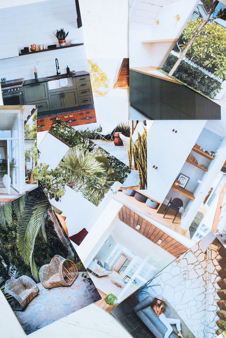
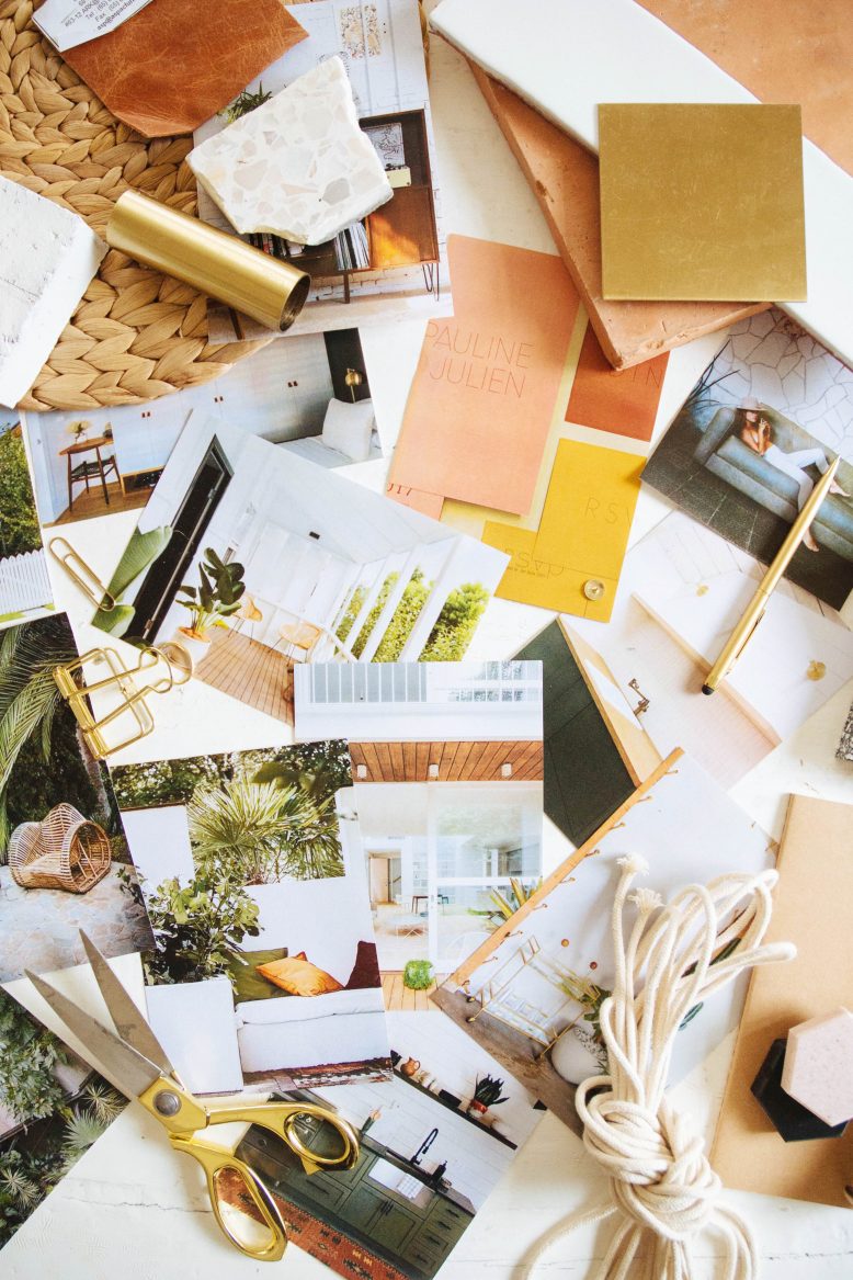
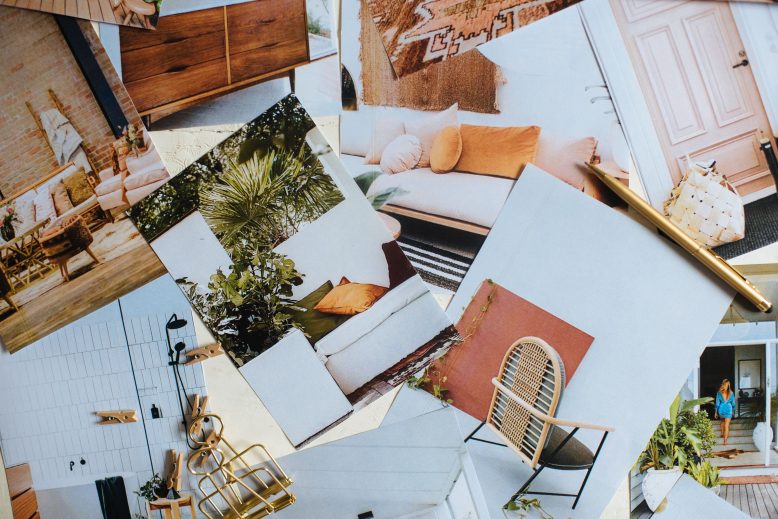
We ran you through all the plans for the house in this post, but what I didn’t touch on was the inspiration for the feel of the house – something that related a lot to the materials that we choose (along with the design elements and details). In general, I was inspired by light bright spaces with personality, with a big open air living space that really felt like home. Rugs, plants and strategic pops of colour would play a role in adding personaility to the space – as I really wanted to steer away from a black and white palette. Below you can see the images that filled my moodboard – with spaces that have a lot of light, vintage details and decor that brings a lot of personaility.
Choosing The Materials
In truth, if it was up to me I would still be stuffing around workshopping different tile options, but if there’s one thing Ben’s good as it’s not wasting time, so we chose the materials for the house relatively quickly. That said, I had spent a decent amount of time in the lead up to the actual choosing making mood boards and understanding what styles we thought a) would suit the house b) be interesting and c) not date too much. It’s a challenge to balance those things but I THINK we’ve done ok.
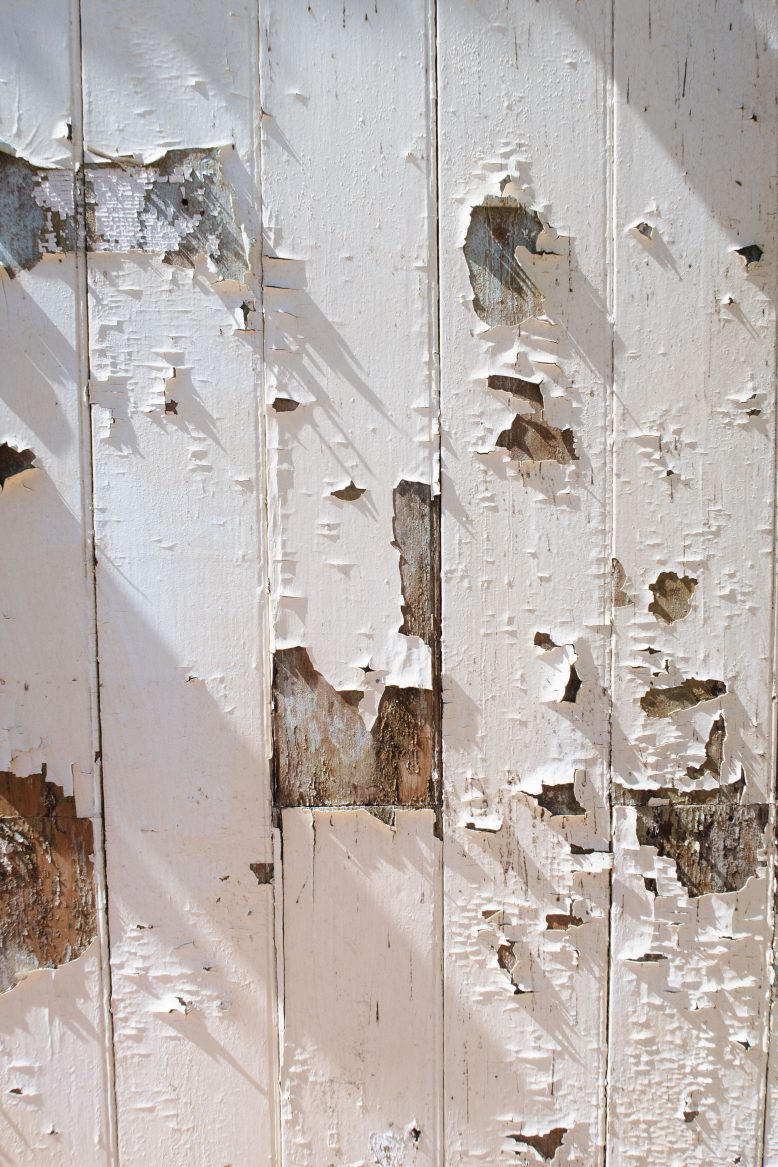
- Loving this old wall!
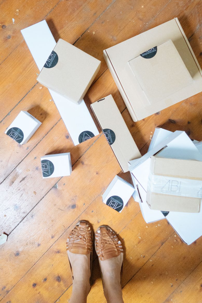
- When all your tapware arrives and it feels like Christmas!
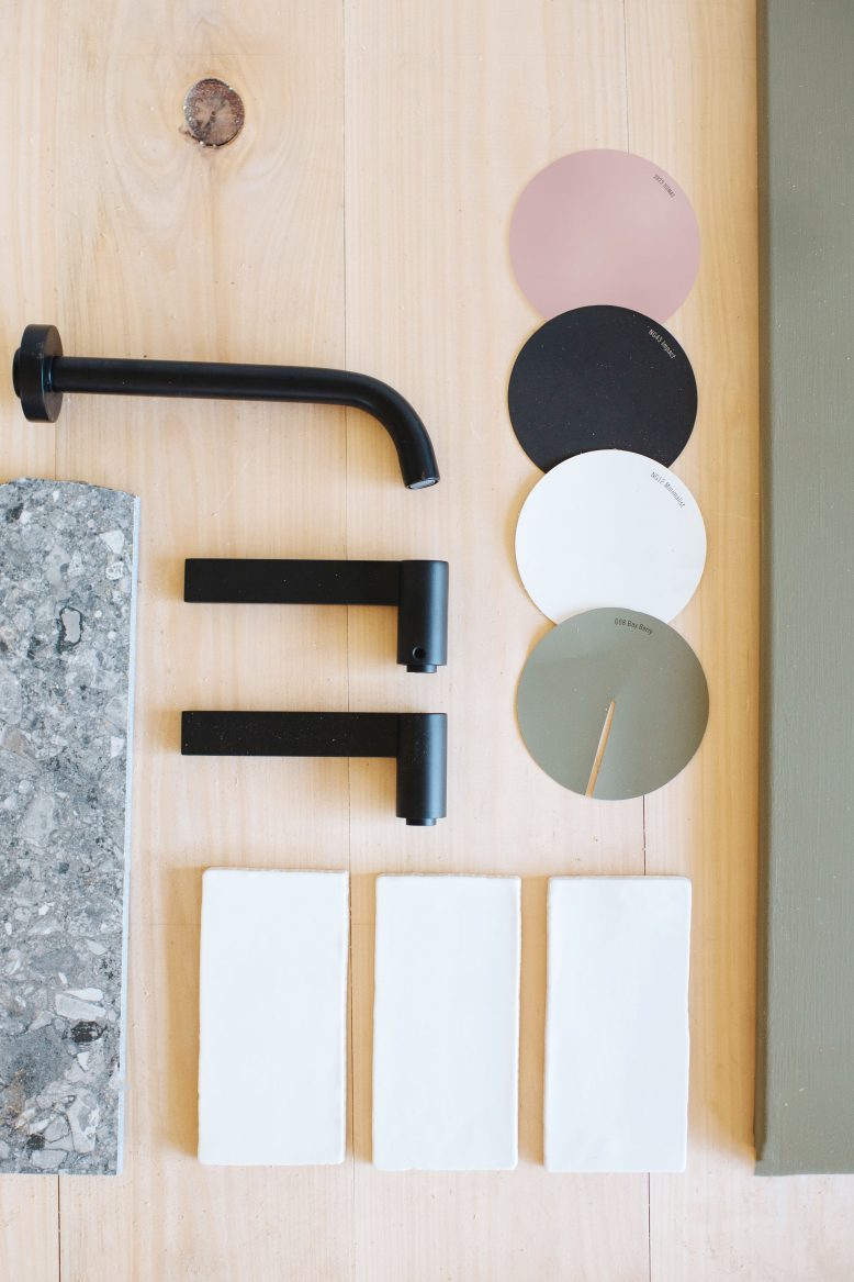
Our Renovation Materials
Tiles
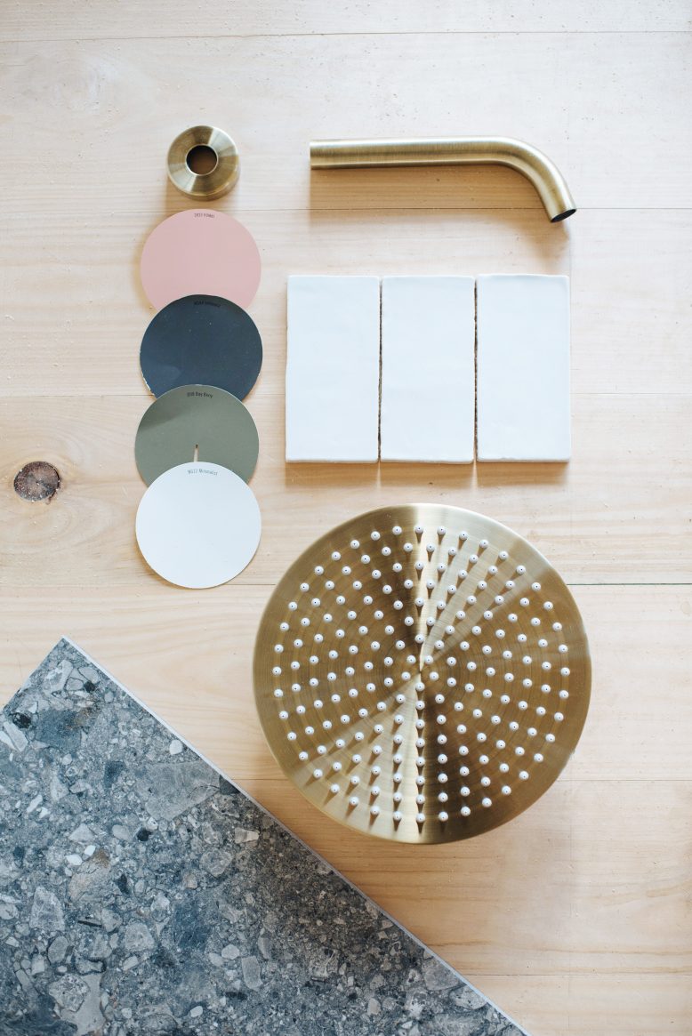
As you would have seen in the post where we discussed tiles in more detail, we chose a very simple slightly textured subway tile for our wall tile from Tilecloud and decided to lay it… Vertical! This might come as a bit of a let down to some of you who were all for the herringbone. But after discussing it long and hard with Ben, we decided this is a style that best suited the house and the rooms we would have it in. Not only did we take into account aesthetics, but Ben reminded me that various tile layouts will have different labor costs involved, something that is so so obvious but I hadn’t thought about. Once we did the numbers this one was our chocie! It looks great now that I have seen it up so I’m glad we chose it, you can let me know what you think soon! (Another tile I absolutely love love love, but which was sadly released after we bought ours, is this one).
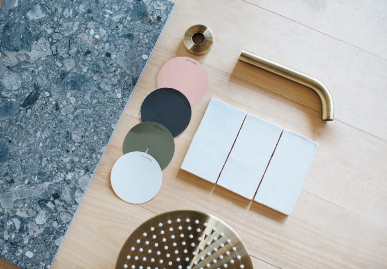
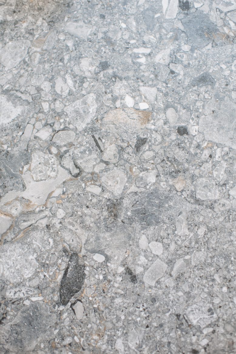
For the floors, one trend that I have been loving in the tile department is terrazzo. But I was always a little nervous that it would date too much, particularly if we chose it in a coloured style. For a second there I was realllly into this pink terrazzo tile… But luckily I moved on from that because I think it would have been wayyyy too much. Instead, we went for a more subtle version of the terrazzo tile – this grey terrazzo style tile.
Metal Tapware
This is an area I was sooo excited to get stuck into – taps, door handles and metal details… You know you’re OLD when this stuff starts to excite you. I have always loved brass fittings (ie gold) but was surprised about how hard it was to find really great ones that didn’t blow the budget and didn’t look too shiny. After searching high and low I stumbled upon ABI Interiors, which have an amazing (and affordable!) selection of brass metal tapware of all types, all in matching colours so that all the metal details of a space will match (you can even shop by colour). Because we have been designing a separate upstairs and downstairs, we decided to do really nice matte black tapware upstairs (Mondella & Caroma from Bunnings), and brass hardware (from ABI Interiors) downstairs. Ben’s view is that you don’t want to mix up hardware colours across the one dwelling/space. And I do what I’m told! I was surprised by just how much different hardware you need for a space – not only taps and shower heads but bottle traps, waste covers, sinks etc etc etc. Oh and in case you’re interested this was my ultimate but it was outside the budget… Maybe next time!
Paint
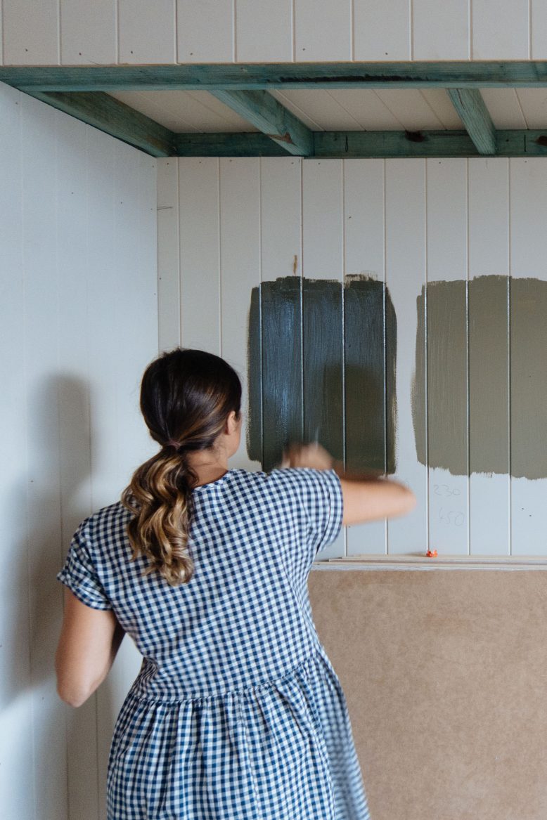
For those of you who kindly made suggestions on this post, we decided, in the end, to go with the green and dusty pink palette, with the colours from Haymes Paint. It was a surprisingly hard decision to make, but seeing it in place now I think it works really well. That said, we’ve used the coloured paints quite minimally throughout the house so in case you’re thinking it’s going to be a colourful nightmare you don’t have to worry (at least I am hoping not!). I guess at the end of the day I wanted the house to have personality without being too overpowering… Although those of you who gravitate towards black and white might find it too much. But you can let me know when you see it!
Main colours Minimalist (white), Intimacy (dark grey)
Highlight colours Marengo (mustard), Humas (dusty pink), Cordovan (light pink).
Walls & Floors
In keeping with the traditional style of the house, we chose to keep all the existing walls and floors, and matching the walls and floors in the back extension. We went back and forth about making the extention more modern (as a lot of architects would do) but I think in the end I really liked that we kept it traditional. We had the choice to redo the floors for the whole upstairs, and this was somewhat appealing because the existing floors are a) very warm toned and b) a bit knocked around. But at the end of the day we decided that the floors and the walls contained so much character, that is was worth keeping them as much as possible. That means the floors are a bit knocked up here and there, and some of the walls are hilariously askew, but I love that about it. For downstairs, we went with more of an industrial feel, with sealed concrete floors and flat panelled walls. As simple (and affordable, haha) as possible!
- Love this dark grey terrazzo.
So that’s our materials guys! Crossing my fingers you found it intersting. And in case you’re wondering, yes it has been a little bit intense doing all this while pregnant, but I’ve been lucky that Ben a) does this sort of thing every day so there’s literally zero stress involved and b) he was happy (I think) to take a bit of the load off me.
I’m really excited to share with you very shortly the BTS of the construction for the house, and then the formal ‘after’ shots very soon. Wah!
Read the rest of our renovation series here!
