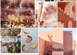
Hey guys! Finally, we can move on to the fun stuff with the renovation…
Not that all the planning and drawing of ideas isn’t fun, but I have to say there’s nothing better than getting stuck into the detail, and going ‘deep Pinterest’ (kind of like deep sea or deep web – a place you may never come back from). Everything is roaring along with the renovation – because we’re not living in it while we do it, things can happen at a much quicker pace. Meaning…. We’re choosing all the details, fitting and finishings for the house. Yippeee!
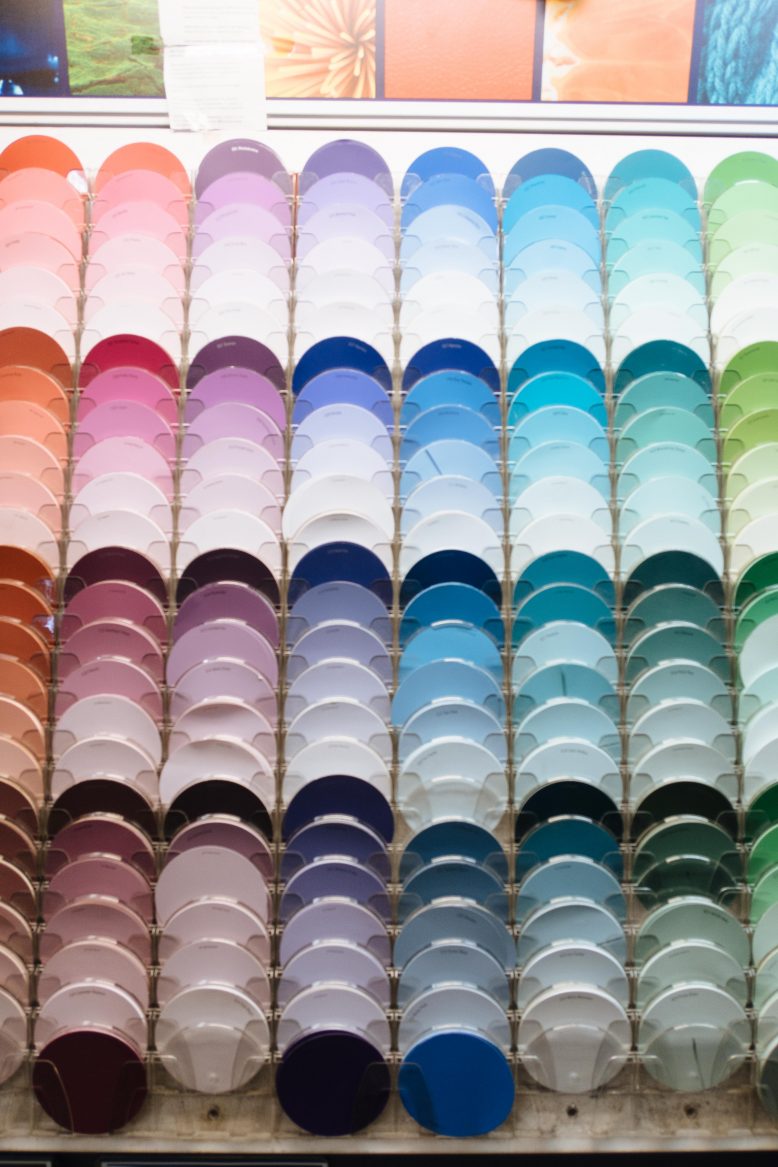
Something I was excited about from the very beginning was getting your input and feedback about the ideas that we have for the house… Call it crowdsourced renovating. And there’s no better area than for you guys to have your say than about the colours… Paint colours are completely subjective and come down to your taste, but I’m keen to hear what you guys think. For this reno we’ve teamed up with Haymes Paint for the whole house – they have heritage inspired colours which will be great for the exterior and lots of gorgeous, simple and unique colours for indoors. Yay!
Our Plans
Before we get into the nitty-gritty of you guys giving me your honest opinion about two potential colour palettes, I wanted to give you a bit of a rundown of what we’re planning generally. To start with, we thought about what the overarching goals for the house are – and worked out that it needs to be simple, minimal but also have a bit of personality. So rather than sticking with a palette of just say white and black (which, admiteddly, would look great in the house), we’re choosing to add a few highlight colours into the house by way of cupboards, flat painted pieces of furniture and shelves. This will all be on a base of a light and bright white so won’t be too over the top… I promise! Scroll on for two palettes we’re considering.
Help us choose the colour palette for our renovation!
Option 1: Pink & Mustard
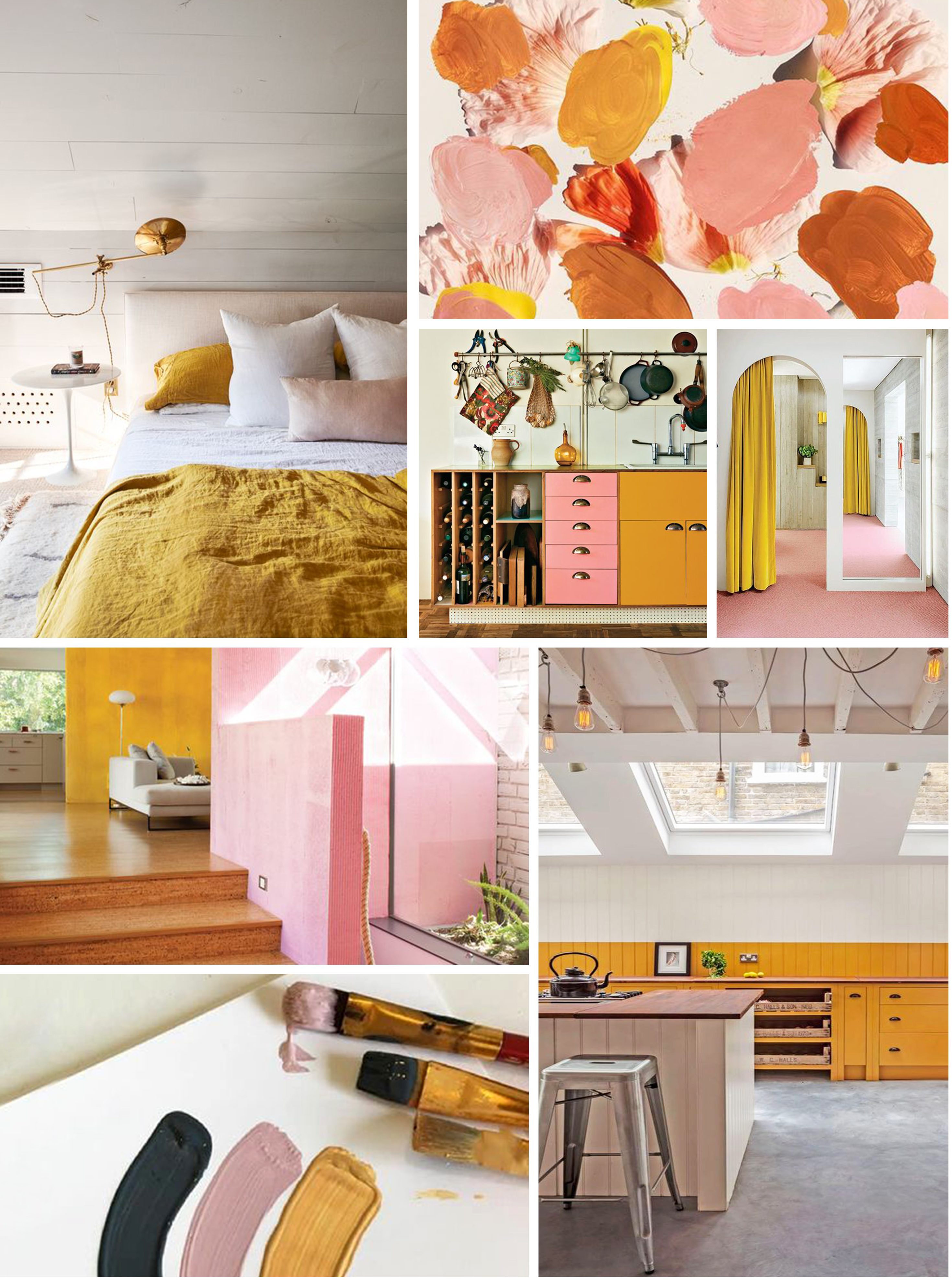
Well well well. If it isn’t my absolute favourite colour palette ever… You’re probably not surprised to see these tones make an appearance in the potential line up. I think these colours would look great as the odd cupboard door, shelf or cabinet here and there around the house. I like the warming, 70’s atmosphere of them paired together. On the other hand, part of me thinks they may date a bit too quickly for my liking, and that they might make a bit too much of a statement… I’d love to know what you think!
Colours
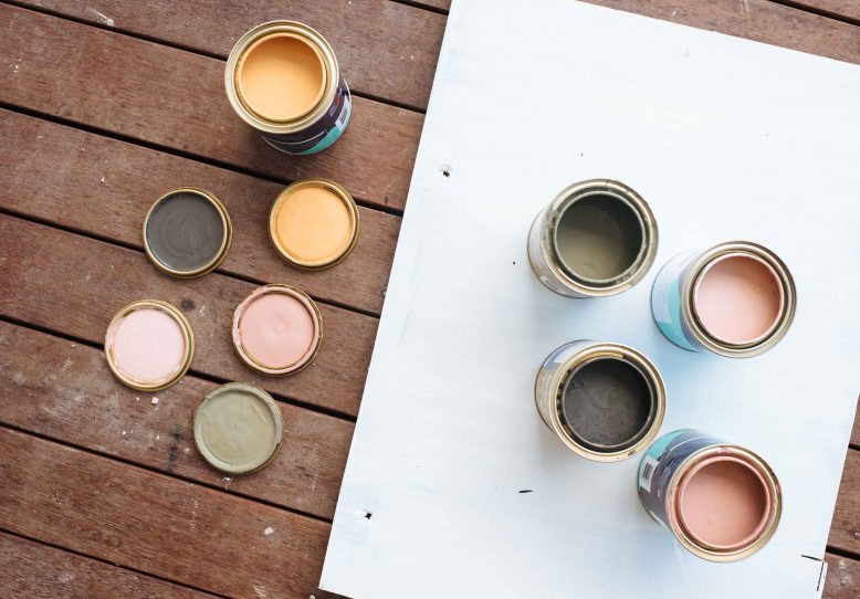
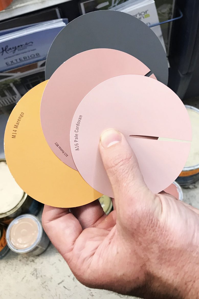
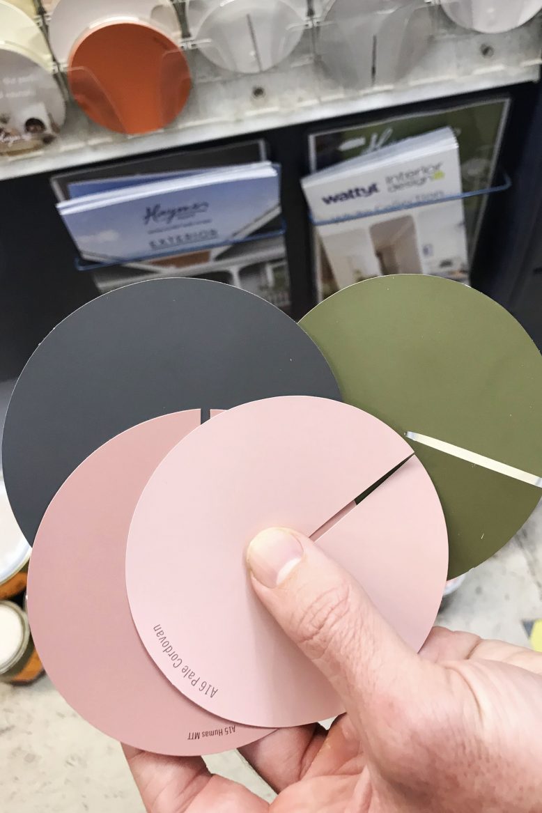
Main colours Minimalist (white), Intimacy (dark grey)
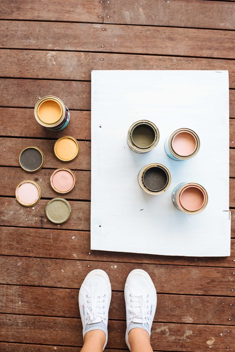
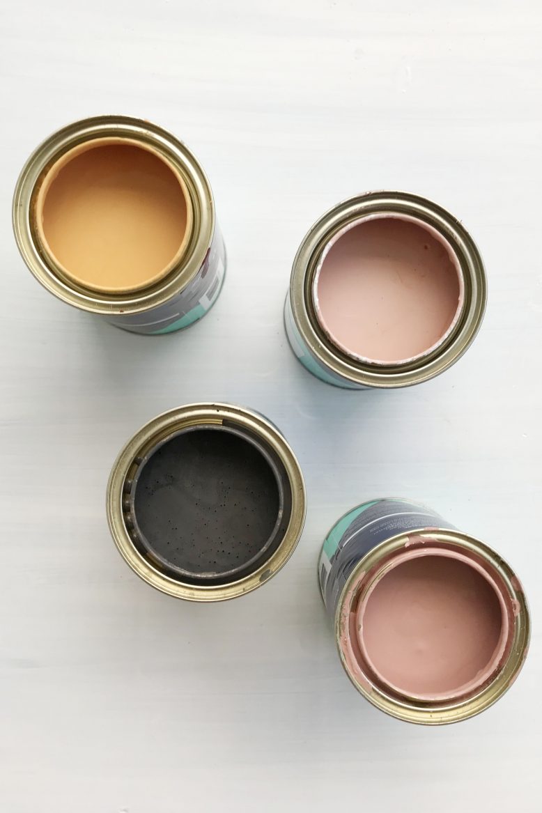
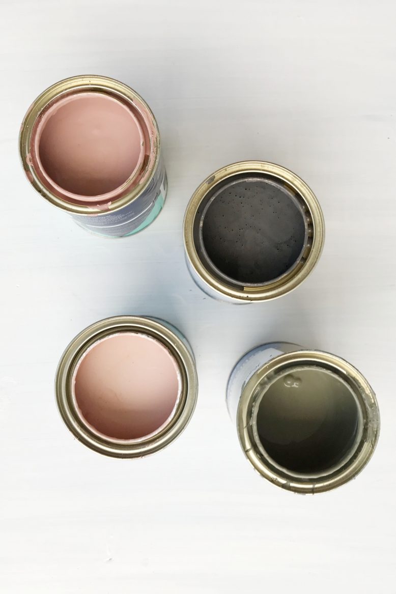
Highlight colours Marengo (mustard), Humas (dusty pink), Cordovan (light pink).
Inspiration
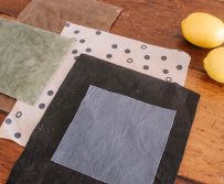
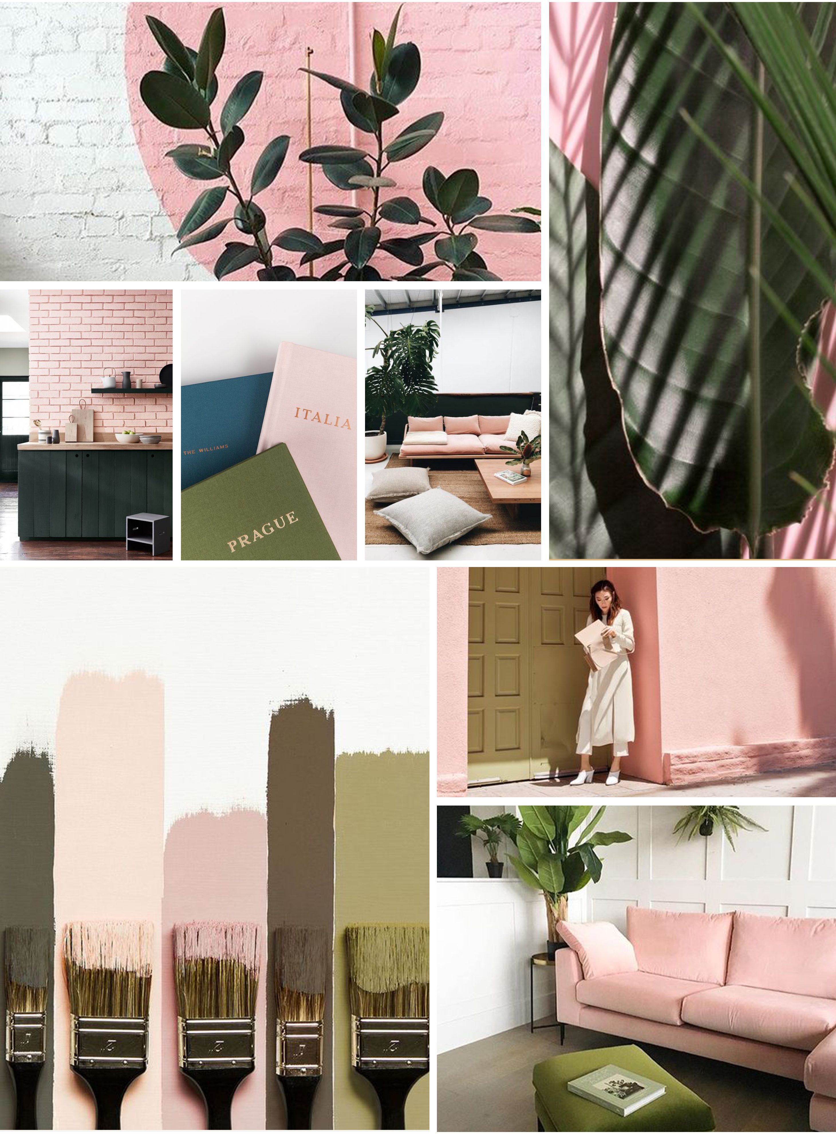
You can see some inspiration below that I like and could potentially see myself living amongst… Once again remember that we’re not painting whole walls these colours, they’ll be incorporated on cupboards, cabinets and shelves, and obviously soft furnishings too!
Option 2: Pink & Khaki
Ok, onto the next option! This time, we’re moving away from the 70’s vibe and going for a bit more of a botanical, pared back feel. We’ve kept in the pink because the Haymes ‘Humas’ pink – which is a cool dusty pink – is such a great tone and one that I really want to incorporate into the house. We’ve replaced the mustard with a light khaki colour, one that I think ups the cool factor a bit and also makes it feel a bit more minimalist. I love this palette, and think it wouldn’t date too fast which is something I’m quite keen on. It would also be a more subtle statement than option one… But do we want to go subtle?!
Colours
Main colours Minimalist (white), Intimacy (dark grey)
Highlight colours Bay Berry (khaki), Humas (dusty pink), Cordovan (light pink).
Inspiration
Below is the inspiration for the colour palette, I think it would look particularly great paired with all the plants that will (naturally) be in the house.
Question
Ok guys, I am DYING to know. Which one do you prefer? Are you a 70’s gal or do you prefer something a little more muted… Feel free to let me know in the comments section! You might also be thinking ‘Geneva and Ben are you crazy, those are the worst colours ever?!’ In which case you should totally let me know too. There’s no wrong answers here!
This post is in collaboration with Haymes Paint.
Inspiration images via: Jasmine Dowling, Interior Design, Sight Unseen, NY Times, Apartment Therapy, Pop & Scott, Claire Brody Designs , Rose & Grey
